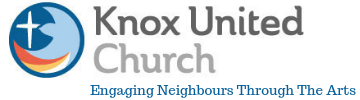
A logo aids and promotes instant recognition. It is a way to visually represent our vision and mission and keep it at the front of our minds. Alex T, our graphic designer, listened attentively to all our input, designed several concepts, met with the focus group, received feedback with tremendous grace, and created the final design for Knox in March of 2015.
Here’s how Alex describes the result:
“The Knox logo is a representation of the holy spirit in the form of a dove, cradling a star in its wings, giving guidance and protection. The illustration style takes a modern approach in line with Knox’s vision, and uses representational imagery and symbolism to communicate its themes.
“The shapes and composition hint at the flow of wind and water, lending motion to the layout and providing a frame to give focus to the solitary star which speaks to the idea of navigation, a guiding light from the heavens whose form mirrors the shape of a cross. The central themes focus on movement and direction, a fusion of the main ideas and imagery that Knox has arrived at through its recent process of discovery and renewal; the winds of change, nautical themes, the act of embracing the future in faith, and casting off from familiar shores.”
How does the new emblem speak to you about Knox’s vision and mission?
OUR VISION: The winds of the Spirit are blowing us in new directions! Along the way, Jesus is our compass, song fills our sails, worship and prayer sustain us, and love and care support us in rough waters.
OUR MISSION: Pushing off from the familiar shores of the past, we journey forward, experiencing the Holy, seeking justice, and comforting the lonely.